
Typography in Graphic Design: The Skill That Separates Amateurs from Professionals
- cmadolla
- Feb 12
- 5 min read

Let me say this clearly: most beginner designers don’t have a creativity problem. They have a typography problem.
You can have a great idea. You can understand colour. You can even know design principles. But if your typography is weak, your work will always feel slightly off.
Typography is not just choosing a “nice font.” It’s the way text is structured, spaced, emphasized, and controlled inside a design. It is the voice of your visual message. And when that voice is unclear, the entire design suffers.
If you truly want to grow as a designer, typography is not optional. It is foundational.
Typography Is How Design Speaks
Every poster, website, logo, or brand identity carries words. Even minimal designs rely on text somewhere. The way those words appear determines how they are perceived.
Think about walking past two cafés. One has a clean, balanced, modern sign with confident letter spacing. The other uses a random script font stretched awkwardly across the window. Before you even step inside, you’ve already judged the quality.
That’s typography doing its job — or failing to.
Typography communicates personality before anyone reads the message.
A luxury brand might use elegant serif fonts with generous spacing. A tech startup often leans toward clean sans-serif fonts with sharp alignment. A children’s brand might use rounded, playful letterforms. Each decision shapes perception.
You are not just placing text. You are shaping tone.

Choosing Fonts With Intention
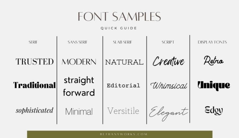
A beginner can often be identified by their careless font choice. It's tempting to choose fonts based on their "cool" factor, but professional typography focuses on appropriateness. Serif fonts, with their small finishing strokes, convey tradition and trust, making them ideal for editorial design and luxury branding. Sans-serif fonts, on the other hand, feel modern and clean, suiting tech brands and contemporary layouts. Display fonts are expressive and attention-grabbing, effective for headlines but unprofessional when overused.
Many designers err by mixing too many styles, using three fonts in one layout, or placing decorative fonts in paragraphs, resulting in random, unstructured pairings. Strong typography is disciplined, often using only one or two fonts, and relies on weight, size, and spacing for variation. If a design feels chaotic, reducing the number of fonts is the first step to improvement.

The Power of Hierarchy
Design should guide the viewer's eyes, establishing a hierarchy of information.
Hierarchy dictates the order of attention and flow, determining what is seen first, second, and third.
For example, on an event poster, the event name should stand out, followed by the date and location, with supporting details being less prominent. If everything is bold and large, it becomes hard to understand, leading to disinterest.
Hierarchy is achieved through size, weight contrast, spacing, and positioning. A bold, oversized headline grabs attention, a lighter subheading supports it, and body text is subtle yet readable.
Magazine covers exemplify this with unmistakable main headlines and varied supporting lines, creating rhythm and intention.
Effective typography communicates clearly and in order, rather than overwhelming the viewer.
Bold & Strong (Impact, Power, Sports)
These fonts feel confident and aggressive.
Good Fonts:
Bebas Neue
Oswald
Anton
Impact (used carefully)
Teko
League Spartan (bold weights)
Best For:
Sports brands
Streetwear
Event posters
Fitness brands
Motivational content
Why they work: Condensed, tall, heavy letterforms command attention. Perfect for headlines.
Not ideal for body text.
Friendly & Playful (Approachable, Youthful)
These fonts feel warm and relaxed.
Good Fonts:
Nunito
Quicksand
Baloo
Comfortaa
Fredoka
Rounded versions of Poppins
Best For:
Kids brands
Cafés
Lifestyle blogs
Social media brands
Creative side projects
Why they work:Rounded edges soften the tone and feel welcoming.
But be careful — too playful can look childish if not controlled.
Elegant Script (Feminine, Personal, Boutique)
These fonts mimic handwriting and feel expressive.
Good Fonts:
Allura
Great Vibes
Playfair Script
Abril Fatface (paired with script)
Modern calligraphy fonts (used sparingly)
Best For:
Wedding brands
Beauty salons
Boutique packaging
Personal logos
Important:Never use script fonts for long paragraphs. Use them as accents only.
Script works best when paired with a clean sans-serif.
Vintage & Retro (Nostalgic, Character-Driven)
These fonts carry personality and history.
Good Fonts:
Cooper Black
Abril Fatface
Rockwell
Clarendon
Lobster (used carefully)
Retro display fonts
Best For:
Coffee shops
Barbershops
Craft brands
Retro apparel
Throwback posters
These fonts add character — but too much can make a design look dated.
Editorial & Serious (Authority, Trust, Professional)
These fonts feel credible and structured.
Good Fonts:
Times New Roman (used well, not lazily)
Georgia
Merriweather
Lora
PT Serif
Best For:
News platforms
Academic design
Corporate documents
Publishing
These communicate seriousness and reliability.
Readability Over Decoration
There’s a dangerous trap designers fall into: prioritizing style over clarity.
Yes, decorative fonts are attractive. Yes, dramatic typography can be powerful. But if your audience struggles to read your message, the design has failed.
Body text should almost always be simple and readable. Headlines can carry more personality, but even then, clarity must remain.
Think of typography like a conversation. If someone speaks in a heavy accent, too fast, with dramatic pauses and unnecessary flair, it becomes exhausting to listen. Clear communication wins.
Your typography should never make the viewer work harder than necessary.
Typography and Brand Identity
Typography is a powerful tool in branding, essential for creating a brand identity. A brand is a system, not just a logo, and typography is one of its strongest visual elements.
For a calm wellness studio, you might select a soft serif font with a light sans-serif, generous spacing, and a peaceful tone. In contrast, a high-energy sports brand might use bold, condensed typography with tighter spacing and strong contrast.
Font choice reflects personality and is not random. Consistency in typography across various platforms like social media, packaging, and websites makes a brand recognizable and trustworthy.
Typography is not just decoration; it is the essence of identity in branding.
How to Pair Fonts Properly
Here’s a safe formula:
Headline: Strong personality Body: Clean and readable
Examples:
Playfair Display + Montserrat
Bodoni + Inter
Bebas Neue + Open Sans
Cormorant + Poppins
Oswald + Lato
Keep contrast clear. Don’t pair fonts that look too similar.
A Real Designer Tip
Instead of downloading 200 random fonts, master 10–15 high-quality fonts deeply.
Learn:
Their bold weights
Their light weights
How they behave in uppercase
How they behave in long text
How spacing changes their tone
Professionals don’t rely on quantity. They rely on control.
If You Want to Improve
Stop chasing new fonts every day.
Instead, choose a few high-quality typefaces and learn them deeply. Experiment with weight variations. Practice creating layouts using only typography. Study magazine spreads and brand guidelines.
Try designing a poster using only black text on a white background. No images. No colours. If it looks strong, your typography is improving.
That kind of discipline builds real skill.


Comments